Let's Play a Game of Inches Using Valid and Awful CSS Units
Published on
We all use ems and rems and pixels in our CSS. Have you ever used inches or centimeters? Believe it or not, ins and cms exist! They probably shouldn't.

Inspired by my own post on how ems got their names and staying curious, I started mucking around with some other CSS units. Not the usual suspects, mind you — we’re not talking px or rems or even vh and vw. Those are awesome and handy.
I’m talking about the not-awesome and not-handy ones. Inches (in). Centimeters (cm). Stuff like that. Browsers support several CSS units with no place in the digital world. Did you know there’s even a quarter millimeter (Q)? I don’t ken the use of a quarter millimeter in the real world, much less understand how I’d adequately use it to write solid styles that work across myriad screens.
I’ve never used inches or centimeters in any CSS I’ve written. I’ve never seen inches or centimeters in any CSS I’ve worked on. Like … ever.
Let’s give ‘em a whirl, though. Right now. I’m not expecting much, but maybe these things will surprise me. Maybe there’s something revolutionary and cool hiding in the dark recesses of the CSS spec we’ve all just slept on.
I doubt it, but I hope.
The Set Up
I’ll be creating a pen for this experiment as I go. I’ll talk … er, write … through it first, though. If you’re not in it for the boilerplate, jump straight to the working code.
We’ll keep this simple: two divs, one with a width of 1in and one with a width of 2.54cm. Those should be the same width. I’ll give each a top border so we can see ‘em, too. I’m using a top border instead of a background color for a11y reasons, of course.
Then I’m gonna bust out a ruler and measure my computer screen. Lo-fi. I’m writing this on a 2017 15-inch MacBook Pro. Yeah, yeah … I’m in sore need of an upgrade. Never minding that, I wanna see if CSS’s 1 inch is anywhere close to reality’s 1 inch. I’ll do the same on my phone: an iPhone 13 Pro.
First, My Expectations of CSS Inches
Plainly?
I think these things are gonna suck. Whatever not-an-inch arbitrary length these things render, it won’t be anywhere close to an inch. I bet 1in is pegged to some random pixel length or silly ratio of the screen’s width.
My hunch is that inches work like percentage units.
Next, My Expectations of CSS Centimeters
Ditto on everything said for inches above. I’m also expecting these to suck, just in metric.
Finally, My Far-fetched Hope
You know what would be stupendously cool? If inches and centimeters actually render as inches and centimeters. On-screen, I mean. On any screen.
The browser knows your current resolution. The browser knows the hardware it’s running on … at least to a reasonable extent. Doesn’t it have everything necessary to do the sweet little triangulated calculations and determine how many pixels it takes to render something as big as a real inch?
Imagine the boundless possibilities. We could build a digital ruler, a digital tape measure, a digital yardstick, a digital slide rule, or a digital triangle ruler. If we accessed our digital ruler on a Fold or a Flip or a Razr we could even build a folding ruler!
It would blow the internet wide open.
…
Or not.
Also, to be clear, this is not my expectation. I repeat myself: both inches and centimeters will be weak, something fierce.
Let’s Do This: Inches and Centimeters in CSS
Our code is light. Here’s the markup:
<div class="inch-me"></div>
<div class="centimeter-me"></div>
Here’s the CSS:
.inch-me,
.centimeter-me {
  height: 1px;
  border-top: 24px solid;
  margin: 24px;
}

.inch-me {
  width: 1in;
  border-color: blue;
}

.centimeter-me {
  width: 2.54cm;
  border-color: green;
}
I just plopped it in a pen. Let’s see what happens …
The Results
I was wrong!
These units are even crappier than I expected.
1in is not 1 inch on my computer …
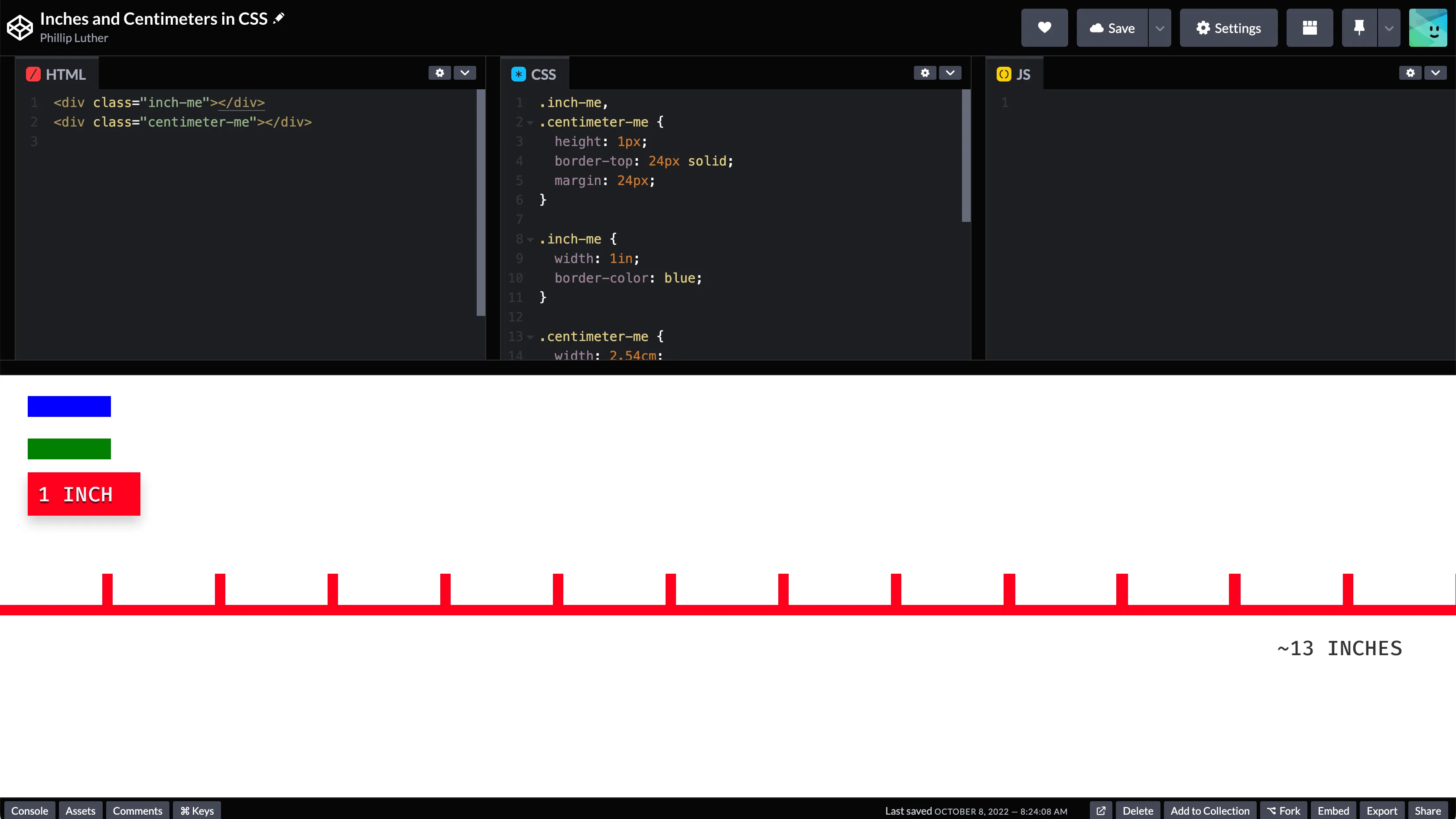
… nor is 1in 1 inch on my phone.
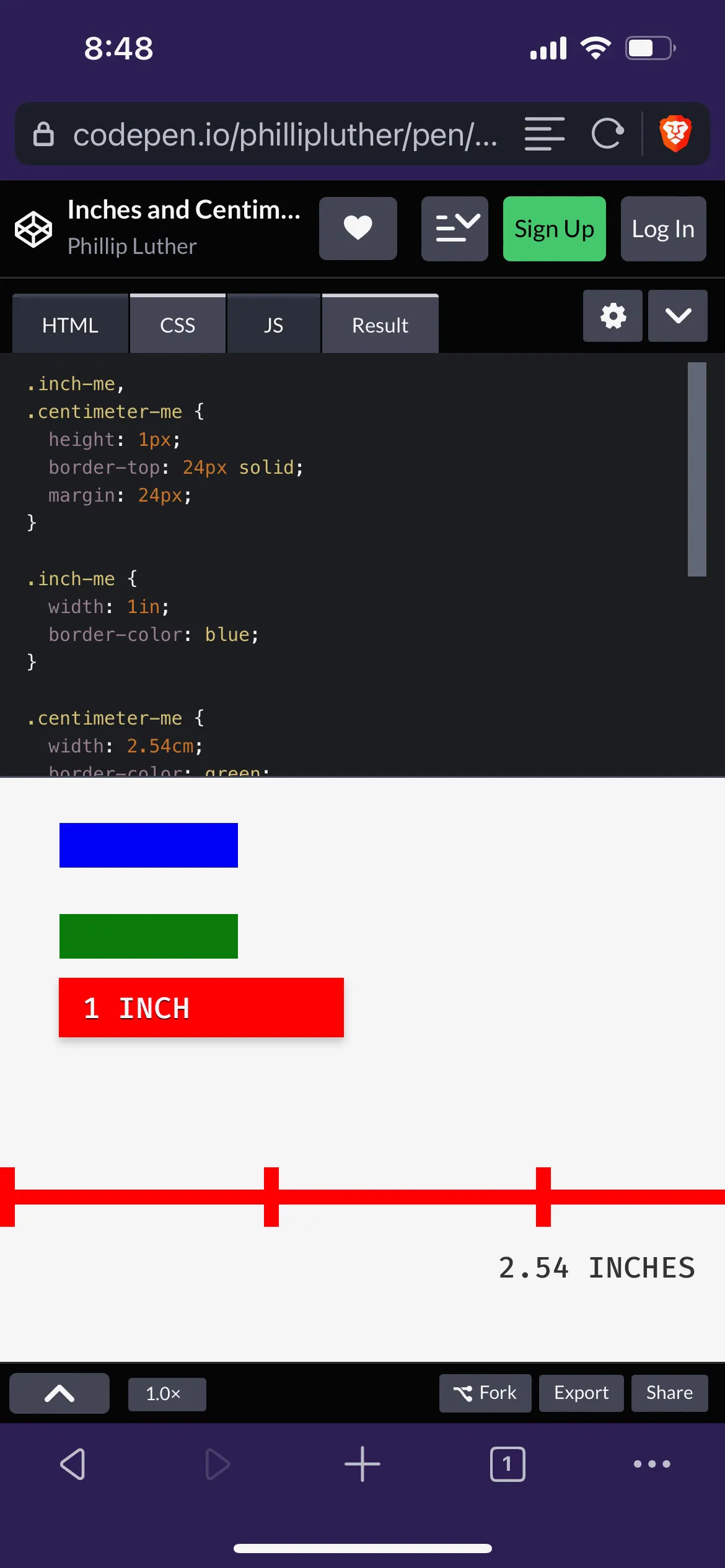
The 1in on my computer does not equal the 1in on my phone. Nothing is 1 inch-ish about 1in on any device I own. Somehow worse yet, that 1in scales up/down when you zoom in/out. It seems to behave like px more than percentages, my original theory.
The only thing 1in seems to get right is that it’s the same size as 2.54cm — whatever the arbitrary length of this “inch,” it’s at least correctly pegged to the equally arbitrary measure of this “centimeter.”
Digging Deeper, Though We Can’t Tell How Much Deeper Because Our Inch is Broken
I can’t let this sit.
Inches and Centimeters Represent Pixel Values
In doing a bit of sleuthing, in and cm are — in fact! — fixed pixel values. 1 inch apparently equals 96 pixels, and 1 centimeter is 37.8 pixels per MDN. So … 1 inch is 96 pixels. WTF sense does that make?!
I used to have a 19” CRT monitor. Its resolution was 1280 x 1024. That 19” is a diagonal measurement. Hence, geometry tells me the screen had about 14.8” of horizontal real estate and a pixel density of about 86.27/inch. Bless you, Pythagoras.
86.27 is not 96.
My 15” MacBook touts a pixel density of ~220px/inch. It’s a retina/2x display, so let’s call it 110px/inch.
110 is not 96.
You get it. I’m not bothering with the same exercise for my phone.
Why Would You Think 1 Inch Has Anything to Do With 1 Inch?
I checked the W3C spec for implementing CSS absolute units.
Before you ask, let me answer your question: Yes, I’m that pedantic.
It’s dense reading, and I’m not gonna pretend to understand much of it, but the long/short is that most devices are more concerned with pixels than physical units like inches and centimeters. That makes sense to me as an application developer; when I think about writing responsive CSS, I pay attention to resolution (1600px vs. 2560px), not physical device size (13” MacBook vs. 15” MacBook).
Resolution is a more relevant aspect of screen layouts. Browsers and gadgets and the like use pixels as their anchor unit to calculate distance and size.
So … 1 inch is 96 pixels. WTF sense does that make?!
Me, about 240 words ago
The whole 1/96 thing is a throwback to 96dpi printing (because what isn’t) and sounds like legacy baggage; that ratio won’t change because it’d break too much old content.
From that same W3C spec module:
[…] physical units were always tied to their physical measurements while the pixel unit would vary to most closely match the reference pixel. (This change was made because too much existing content relies on the assumption of 96dpi, and breaking that assumption broke the content.)
So, yeah … it’s a known and accepted thing.
PHIL: Hey, 1 inch isn’t really 1 inch in my browser!
BROWSER: Welcome to the universe, little man.
To Inch or Not
Before this experiment, I’d gone 20’ish years without writing a single CSS rule using in or cm. After this experiment, I have no plans to start.
There may be some apps out there demanding their use. I’d like to know if there’s something in mapping where you’re trying to provide a distance scale. You may be making something specifically focused on printing, especially at 96 dpi. Maybe there’s something clever you could do in a @media print { ... } query.
Who knows.
Do you? Have you ever employed some of the ruler-esque units? If so, how? Hit me up on social with insights. In the meantime, I’ll stick with pixels as my go-to unit for absolute measurements.